
Colour sets the stage for your website. It’s one of the first things your visitors will notice. Make sure your colours draw them in and don’t push them away!
You want your colour palette to help get your potential customers or clients in the right frame of mind to find out more about your product or service.
Choosing which colours to use is all about the type of business or service you promote. A fruit & veg delivery company might use earthy brown, leafy green and bright citrus yellow, while an airline might use light blues and steely modern greys.
Once you’ve chosen your colours, use them throughout your site to give a sense of rhythm and flow. Be strict! Allow only a few specific variations on your preferred colours, lighten with white or darken with black to create some contrast.
Using your colour palette consistently across headings, body copy and buttons will help visitors navigate your site quickly to find what they are looking for. Above all, keep in mind your website’s legibility on all screen sizes.
Choose your three main colours
- Dominant colour – Represents the kind of business or service you are offering
- Secondary colour – Compliments or contrasts with your dominant colour
- Accent colour – Highlights more minor site elements such as links, buttons and icons.
To keep your colours in proportion, apply the 60/30/10 rule. 60% of the colour you use should be the dominant colour, 30% secondary and 10% accent.
Don’t reinvent the wheel
Most of us have an intuitive feel for what colours sit well together. But, since Newton invented the colour wheel back in 1666, there are some easy guidelines to help you stay on track.
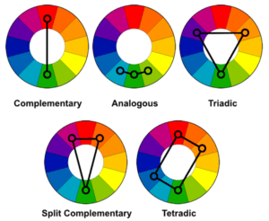
The colour wheel is based on 12 primary colours. These can be endlessly sub-divided as they approach the next colour on the wheel or shaded darker or lighter as they move further in or out.
Complementary colours sit opposite each other on the wheel, like red & green or orange & blue. Choose these to maximise contrast. Complementary colours are bold. They fight for dominance, causing the colours to leap out of the page but they can become tiring if over-used.
Analogous colours sit alongside each other around the wheel. Usually, you choose 3. For a palette of 5, add the next colour alongside both ends. These palettes are pleasing to the eye and create a feeling of harmony. They are often found in nature, for example, in landscapes.
Triadic colours are evenly spaced around the wheel. If you drew a line between them, you’d get a triangle. While less striking than complementary colours, triadic colours still provide excellent contrast. Remember, not all your colours need the same level of intensity. Some may be of a less vibrant hue.
Split complementary colours involve a dominant colour plus the two colours on either side of the complementary colour. This palette will be slightly less intense than using complementary colours.
Tetradic colours are four evenly spaced colours from around the wheel. You’d get a square, rectangular or diamond shape if you drew a line between them.
Monochrome uses just one colour, varied only by lightness and darkness. It can create an immaculate, polished modern feel.
Know your target audience
Pinpoint who you are trying to engage with and how you want your brand or service to make them feel. If your website is aimed at pre-school parents looking for after school care, you might choose creative and warm colours like purple, pink and yellow.
Choose what you want to convey
Colours can signify different traits about brands or services. They play a crucial role in supporting the message your site wants to put forward.
- Red – Energy, power or excitement. Encourages people to take action
- Orange – Optimism, friendship or happiness. Stimulates energy
- Yellow – Warmth, youth or positivity. Commands attention
- Brown – Wholesomeness or honesty. Creates a grounded or historic atmosphere
- Grey – Modernity, stylishness or sincerity. Generates an air of sophistication
- Green – Health, nature or environmental awareness. Invokes balance
- Light blue – Transparency, innocence or calmness. Has huge popularity across sites
- White – Cleanliness or simplicity. Invokes either affordability or high-end elegance
- Dark blue – Trustworthiness, responsibility or maturity. Inspires loyalty
- Purple – Royalty, creativity or luxuriousness. Feels indulgent
- Pink – Kindness, friendship or innocence. Often feminine
But remember, these meanings are not universal. For example, blue is often used to inspire trust by financial institutions, but it could come across as political during US or UK elections. While green is frequently associated with nature, it is also a sacred colour in Islam. White can be considered a colour of mourning in many countries and cultures.
When considering what colours to use for your website, look at what your competitors are doing. Then make sure you do it even better…
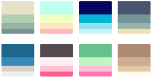
Examples of colour palettes
Follow Us